Elevating Handshake’s Brand
Lead Designer | Brand Design | Handshake | 2013–2014
Handshake disrupted the wholesale ordering process by moving an analog, paper–based workflow onto the iPad (and into the 21st century). Designed for sales professionals on the move, our software reduced errors, increased productivity, and streamlined transactions between buyers and brands.

The Opportunity
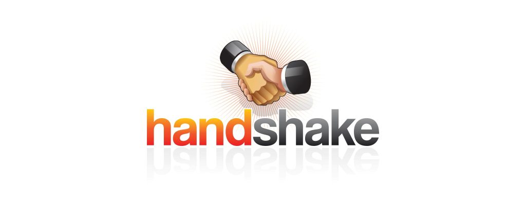
Handshake’s existing brand identity (pictured below) got us from idea to seed round, and as we prepared to raise our Series A, time was right for an overhaul. This was an opportune moment to strengthen our image; a strong, serious identity would be required to attract larger customers.
I was responsible for overhauling Handshake’s branding, as well as leading all design projects. My work covered everything from a new logo, to the marketing site, emails, ads, white papers, social profiles, business cards, office signage, preparing brand guidelines, and more.
My Thesis
The initial question with a rebranding like this is always: how far from the original identity do we stray? Do we simply evolve the identity that we have, or take a radically different approach? This question could only be answered by working directly with the founders, who expressed a intense desire for us to be perceived as a “big tech company.”
I believed that we might need to retain the concept of a handshake, but only if we could express it in a much more abstract manner. Our technology exists to make interactions between humans easier, and I believed that our brand identity needed to be humanized as well. The color palette would need to dramatically expand, and new typefaces would be required to inject personality into the identity.
The Plan
There are many factors to consider when planning an identity redesign. I asked the following questions as we kicked off the rebranding work:
• How many people will be involved in the decision making process?
• How much brand equity does the existing identity have?
• Are any of the stakeholders emotionally invested in this?
• What are all of our touchpoints? Will we be replacing physical assets like signage?
The investment (and risk) are much higher for a brand identity redesign. I knew that it would be important to conduct thorough research and explore all potential solutions—this is the only way to develop an identity that will really stand out.
An iterative process
Our initial research would include evaluating other badge systems and relevant gamified platforms. After evaluating the potential complexity of each badge category, we decided to kick off the project with the Level badges. The existing names wouldn’t change—they were fun and creative: Novice, Hotshot, Vocabularian, Walking Dictionary, and more. These badges would set the tone for the rest of the system:

Competitive Analysis
I started by analyzing the market: gathering all of the marks, logotypes, color palettes, and typography schemes of the competition—all the building blocks of a visual identity.
Critiques
I scheduled regular critiques with my stakeholders, and solicited feedback from peers outside of the company (I was working by myself at this point, and didn’t want to design in a vacuum).
Wireframes
Before extending the new identity scheme to other digital touchpoints, I made sure to wireframe out all of the new screens, working with marketing to develop content outlines, and in some cases write copy.
A/B Testing
Working with our marketing team, I developed multiple versions of each page that we split tested extensively to generate more leads and increase conversions.
Design Work
The core of Handshake’s business is an iPad app, so it was important to develop a strong mark to serve as an app icon. I began the ideation stage by sketching out as many concepts as I could think of (again, this is incredibly important for identity design).
My first set of concepts involved creating connections within or around the letter H—an experiment to see how far we could move away from the literal handshake.
Even at this early stage, it was important to consider how the mark would work in black and white.

Overlapping Symbols
The next concept took us a step closer to my original thesis, and completely dropped the idea of using the H in the mark. My internal team liked the direction this was going, but neither the arrow, plus sign, or heart was particularly hitting the mark. The overlapping X was moving in the right direction, but I really felt that this mark needed to connect together somehow.

Abstract Handshakes
In the next round of sketches, I felt very strongly that this was the right direction to pursue. Our goal was to create a bold, strong, technical mark that would ideally connect with the idea of a handshake. I developed as many different permutations as I could: connected lines, overlapping line, etc. I wanted to get this in front of my team as quickly as I could.
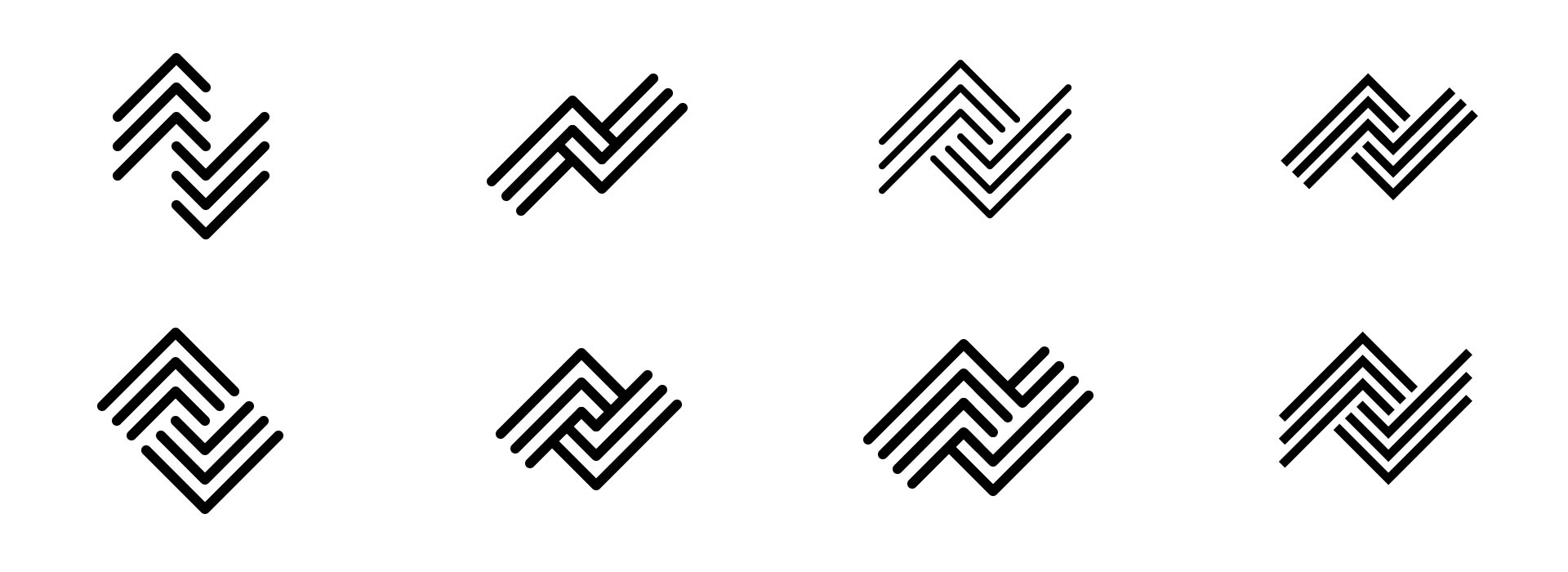
Final Brand Identity
I refined the mark into the final version (pictured below). I was very pleased that we had collectively managed to move on from the literal handshake illustration and adopt a much tighter, abstract mark. Selling this direction took time, and I worked on flushing out the remaining “kit of parts” while the founders contemplated this change.

Color Palette
The existing color palette was orange, black, and grey. My goal was to inject some life and personality into into this business by selecting brighter, friendlier colors. Eventually we settled on this palette, with specific uses for each color.

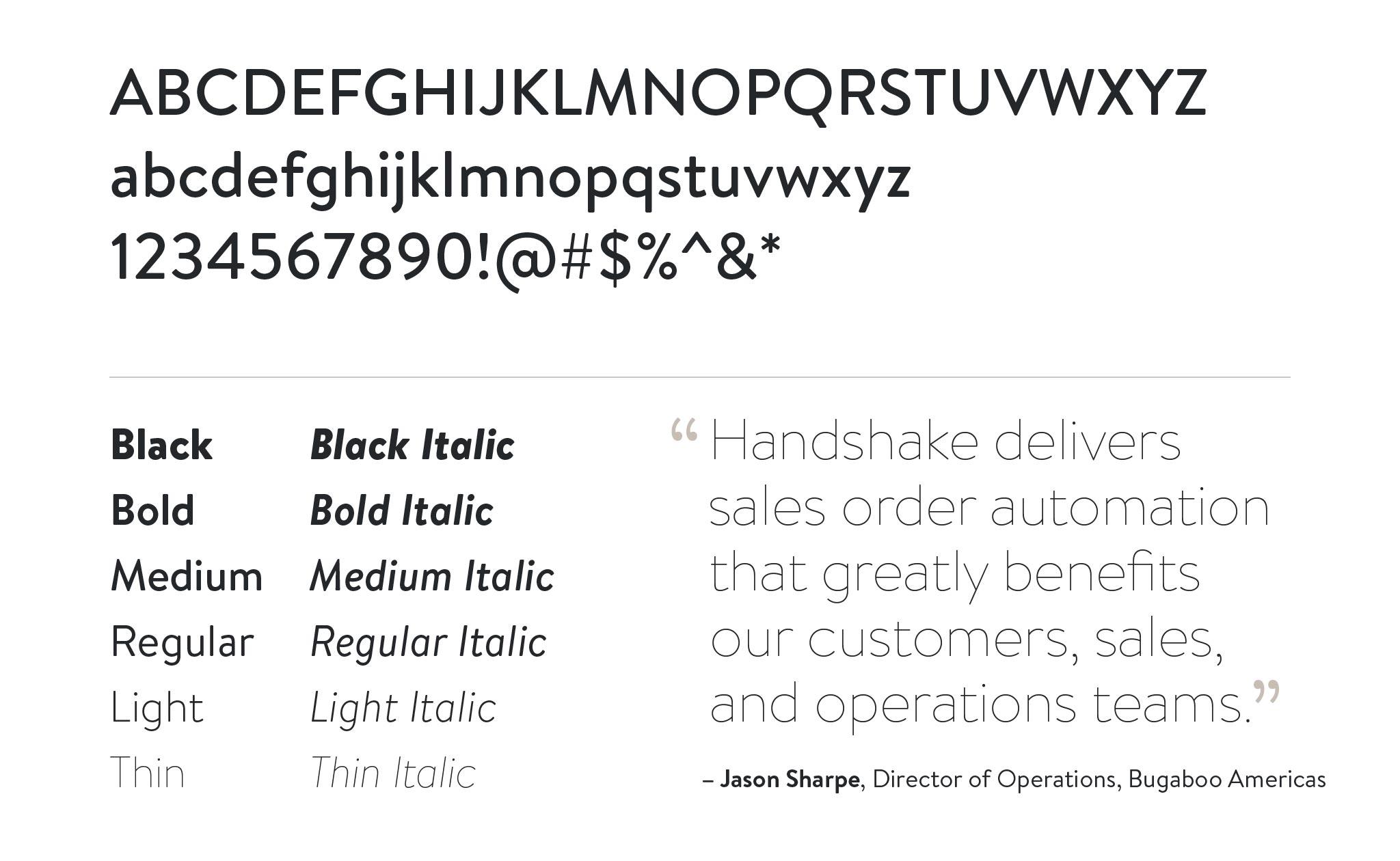
Typography
Typography plays an important role in every brand, and my goal here was to create a more personable image. I selected a bold sans–serif with a wide range of weights to champion the Handshake brand.
Brand Guidelines
I documented our new brand guidelines, which is an essential framework for future creative work. This is important to provide to other teams in the company (like marketing and sales), future design hires, and third party vendors. The examples you see above are included, as well as guidelines for how to use / not use the logo lockup (pictured below).
This guide ensures that the Handshake brand will always be displayed in the manner we intent it to.
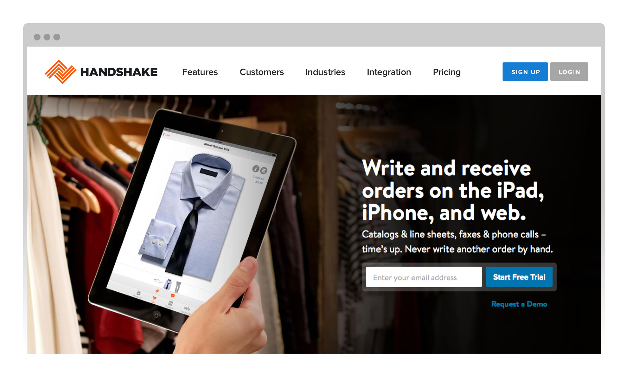
Homepage Design
I worked with the marketing team to create a series of potential new homepage designs. Some of these were implemented immediately with the existing identity). We A/B tested multiple iterations of these extensively, and found a combination that resulted in increased conversions. Once the new logo was approved by our legal team, we implemented it across the website (pictured below).
Alternate Compositions
I mocked up different variations of potential homepages / landing pages as part of the identity redesign process, like the one pictured below.

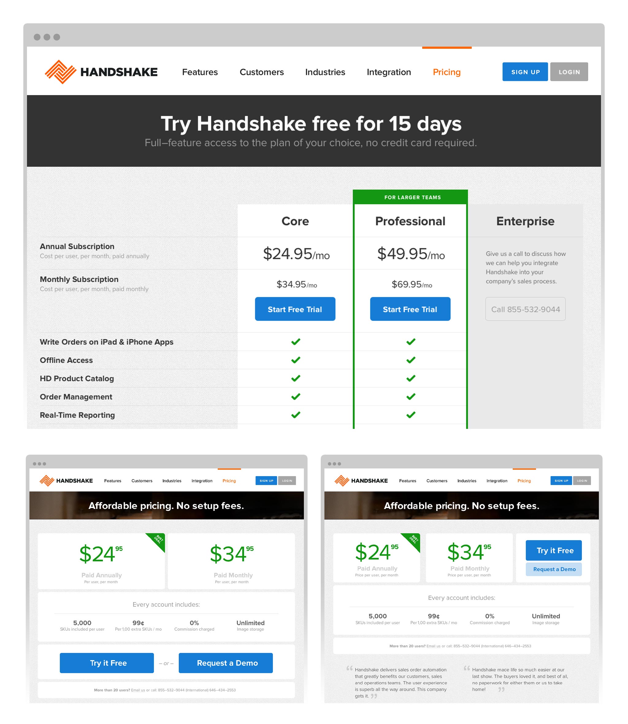
Pricing Experiments
We completely overhauled the pricing page, introduced new tiers, and made the differences between them more readily apparent. This page was constantly being tested and tweaked, and we experimented with many different versions of the business model. The overall goal, of course, was to convert more customers at higher price points, which we achieved within a few months of starting the experiments.
Product Features
Working closely with marketing, I created wireframes for a new Features section. Wireframes are obviously essential for product design, and I’ve found that they’re also very useful for: a) helping develop a content outline and b) aligning all stakeholders on what what these pages will look like.

Photography
Our existing site featured only screenshots of the product, and I decided to source (and shoot) imagery that would show people interacting with our software. This all played back into the thesis of making the new Handshake brand feel more authentic and personable.

Email Marketing
Next I moved on to overhauling our email communications. We created templates, added imagery, and created new iconography to communicate what we needed new customers to do. I helped the marketing team develop new content for each email and drip campaign, reducing the amount of copy so that each email was focused on one or two things at a time.

Illustrations
Seeking to differentiate Handshake from the competition (everyone used stock photos), I developed a library of custom illustrations for blog posts and content marketing. This give Handshake unique imagery to share on social.

Sales Collateral
Finally, we extended the new branding presentations, business cards, sell sheets, sales materials, and all different types of marketing collateral.

Additional Info
• Handshake was acquired by Shopify in 2019, and integrated into their product line as Shopify Plus
• I had the opportunity to discuss designing for the enterprise with Venturebeat