Clover.com Redesign
Design Manager | Visual Design | Clover (a Fiserv company) | 2023–2025
I provided creative direction and feedback / guidance on the user experience for the relaunch of clover.com (the first phase of applying our new brand identity to our website). The website was redesigned by a fantastic team at Code & Theory in tight collaboration with both my team and our Brand Marketing department. In the short span of six weeks, we completed an effort that was off-track, off-brand, and had taken nearly 3 years to come to fruition.

The Opportunity
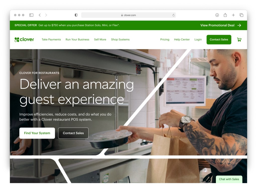
Clover’s website had not changed in at least three years—a lifetime in the digital world—and ran the risk of becoming stale. With the introduction of a new brand identity in early 2023, the opportunity presented itself to breathe some new life into the website, in terms of both the brand and the user experience. Here is a snapshot of the existing homepage:

Our Thesis
Our new brand identity is about connecting with merchants in a real, authentic way—the opposite of our old brand, which was very technical and focused on selling hardware. We believed that in order to create an emotional connection with small business owners, we would have to 1) speak their language and 2) provide them with an opportunity to imagine themselves in the Clover ecosystem. We would accomplish the second part of that statement with photography that was not staged, would not be perfect, and would not what you see from our competitors. It would be real, authentic, and reflect the gritty (translation: not always pretty) reality of running your own business.
The Plan
We had six weeks to accomplish what Clover had attempted to do for 3 years—relaunch our marketing website to drive 10x more revenue through this self-service channel. At the same time, we would infuse our new brand identity into the site. We would also integrate improved analytical tools, so that we could test and measure our success.
Design Sprints
The team at Code & Theory wanted to work in 6 week-long design sprints, and we decided this was the best course of action to bring this project back on track. The pace was fast and furious, and within the first two sprints we had managed to turn the project around.
Critiques
We held critiques twice a week—this was an incredibly fast-paced project. In between reviews my team would provide feedback and help set the C&T designers up for success. I provided creative direction and feedback on the user experience throughout this process.
Design Work
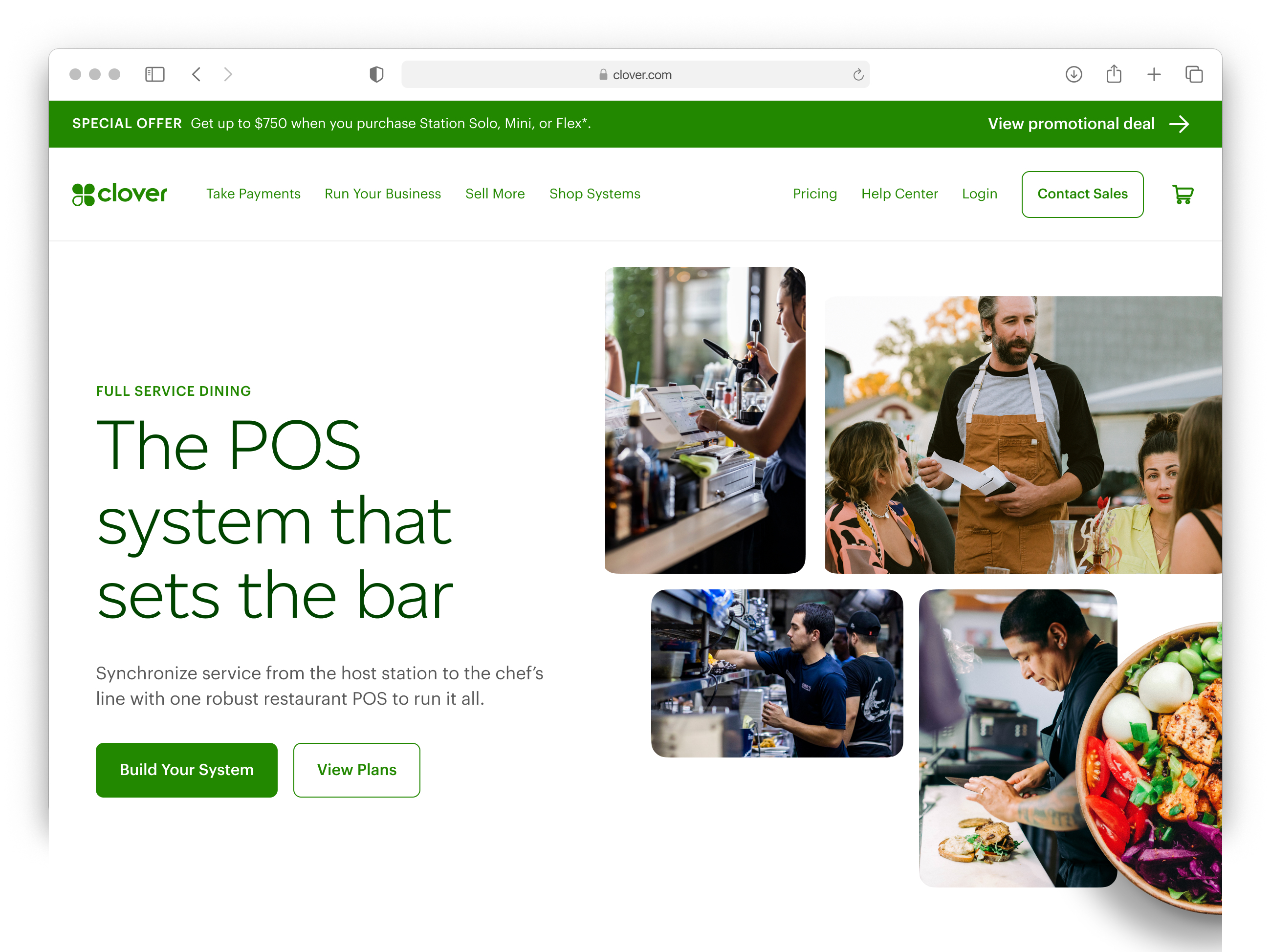
We focused our efforts for Phase I with a set of key pages: our homepage, 3 vertical–specific landing pages (Restaurants, Retail, and Services), and a light global “refresh” for all other page types.

Landing Pages
We designed these pages to communicate the full value of Clover’s ecosystem to prospective merchants. The photography we chose is intended to make that emotional connection: we’re showing merchants the gritty, real, authentic details of their daily grind.

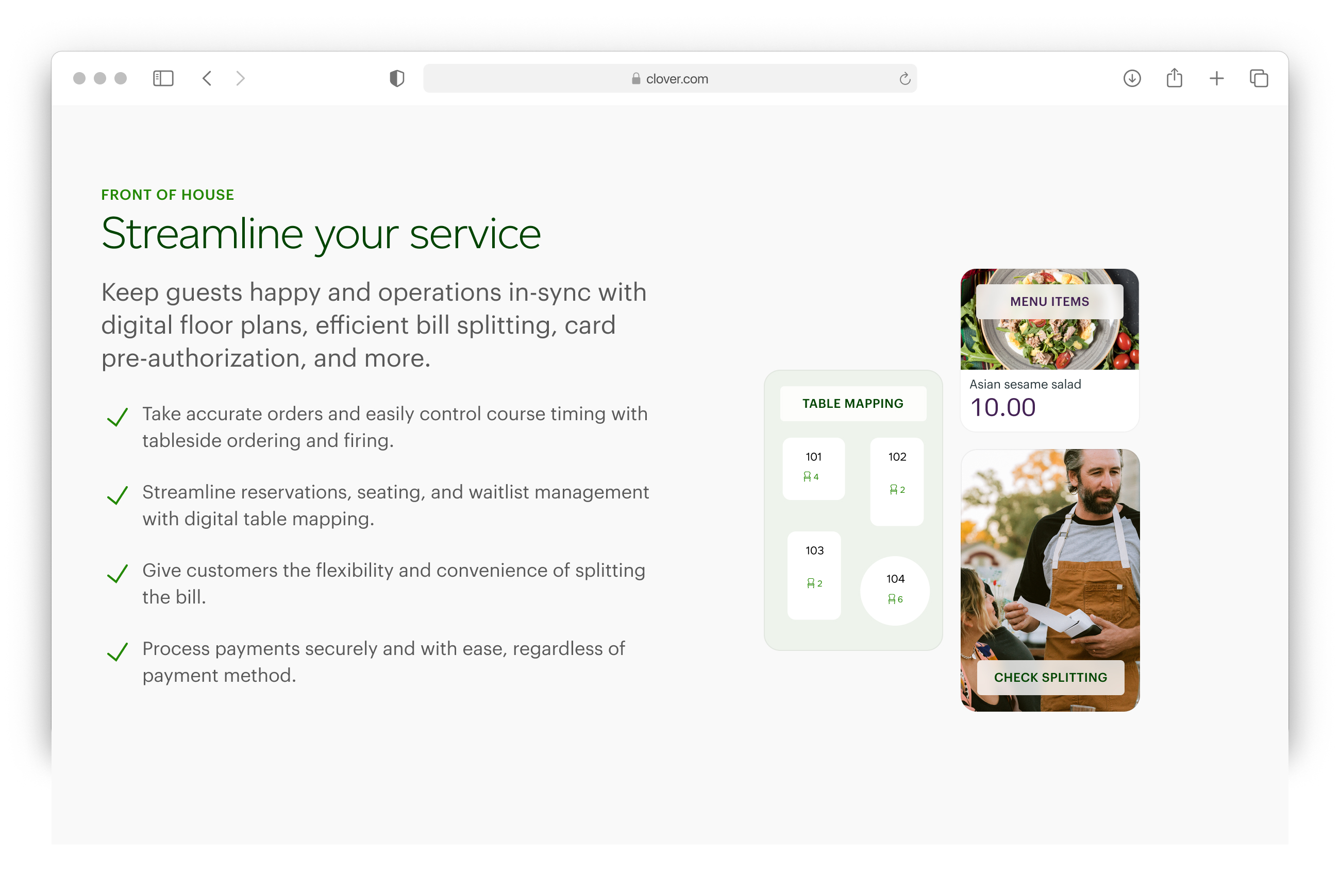
Secondary Pages
The design team came up with an outstanding evolution of our system lines: a bento-box style composition that can communicate the end-to-end experience of running a restaurant (or other type of business, as these serve as a template for other verticals).
One system
We created a module—that can be placed on any page—to communicate the breadth of Clover’s offering. This interactive module is flexible and can grow over time as we build out the rest of clover.com

Content Modules
The team crafted module templates that could be reused throughout all key pages, with a variety of options for imagery and content.

Social Proof and More
We highlighted all of Clover’s integration partners, as well as our existing merchants—social proof can make a prospective merchant a lot more comfortable when it comes down to selecting their Point Of Sale system.
