Transforming Ladders Recruiter
Art Director | Product Design | Ladders | 2015–2018
Ladders is a job board for experienced professionals and high-powered executives that flips the traditional business model. Job seekers will find a curated pool of higher-paying, senior level jobs. Candidates who pay for a subscription can apply to exclusive listings only found there.

The Opportunity
After working on the candidate side for the first six months, I was given the opportunity to own the Recruiter product experience. Historically, the recruiter product was free. The candidate side of the business had driven revenue since the founding of the company.
Recently, the competition had multiplied in the form of algorithm-driven matching services like Hired, Vettery, ZipRecruiter, and more. As a result of this increased competition, the number of paying jobseekers had steadily declined.
In this industry, nearly all of the revenue is driven by recruiter subscriptions and fees. Executives at Ladders realized that they would need to prioritize the Recruiter product, which had not seen any substantial development in the previous 5 years. I was part of a new team (myself, a UX researcher, product manager, and 12 developers) tasked with transforming Recruiter, eventually leading to 22% revenue growth for the company.
Our Thesis
My team felt very strongly that we needed to build a subscription for recruiters. On the candidate side, we had achieved a premium position in the market. With a highly qualified pool of candidates, it made sense to pursue the same goal on the recruiter end. We aimed to fit into the market somewhere on the high end of the cost spectrum (closer to LinkedIn than Indeed, for example).
In order to achieve this, we needed to accomplish three key things:
1. Revitalize the product marketing
2. Upgrade the user experience
3. Determine which features to build
The Plan
My team discovered that the Recruiter product was in an advanced state of disrepair: a mountain of technical debt, combined with glaring UX issues, stood in the way of building a subscription product. We realized that we needed to take a phased approach, starting with somer very basic improvements to the user experience. Our engineering team started tackling the technical debt, while my UX researcher and I worked in parallel to improve the recruiter experience.
Once we had repaired the foundation of our product, we planned to launch our first paid feature: Sponsored Jobs. From there we would add paid features one by one, with the ultimate goal of creating a fully fledged subscription product, with either a limited trial or by taking a freemium approach.
Throughout this entire process, we’d have to remain mindful of the impact that any of our changes would have on the candidate side. Another important factor is that we serve three types of users:
• Agency recruiters: these are external contractors.
• Corporate recruiters: internal employees, usually at larger companies.
• Sourcers: these are users who compile lists of candidates for a recruiter.
Agile Process
Our work was divided up into 2 week sprints, with a product demo and retrospective at the end. We held daily standups each morning, which kept every team member aligned, informed, and motivated.
Agile Process
We crafted personas for six different types of candidates, and constantly solicited feedback and ideas from recruiters. Research was essential for identifying our different customer segments, and prioritizing the development of new features.
Critiques
We held weekly critiques, an effort that I initiated and championed internally. These critiques kept our design team aligned across both sides of the business, and helped raised the bar for our collective work.
Wireframes
Before we dove into visual design for each new feature, we sketched out how it would function. These were useful for selling new features to stakeholders, aligning our team with engineering efforts, for conducting user testing, and for developing content outlines with our copywriter and marketing team.
Clickable Prototypes
We created multiple iterations for each new feature or alteration to our platform, usually through a simple tool like Invision. These prototypes were shared with recruiters in testing sessions.
User Testing
We conducted both moderated and unmoderated user testing with recruiters: sometimes in person, and most often over the phone via a screenshare.
Design Work
When you’re building a two-sided marketplace, it’s important to understand how both types of users interact together, as well as how their needs overlap. Working with my creative director, copywriter, and VP of marketing, I created three user personas for our candidates, which were placed at various points around our offices. These personas would help bring to life some of the most important attributes recruiters were looking for in their candidates.

Recruiter Dashboard
The first page that we decided to tackle was our recruiter dashboard, a key page for recruiters. The existing screen displayed very little information, and was not easily scannable. We started by asking recruiters what information they needed here, and developed new wireframes from this feedback.
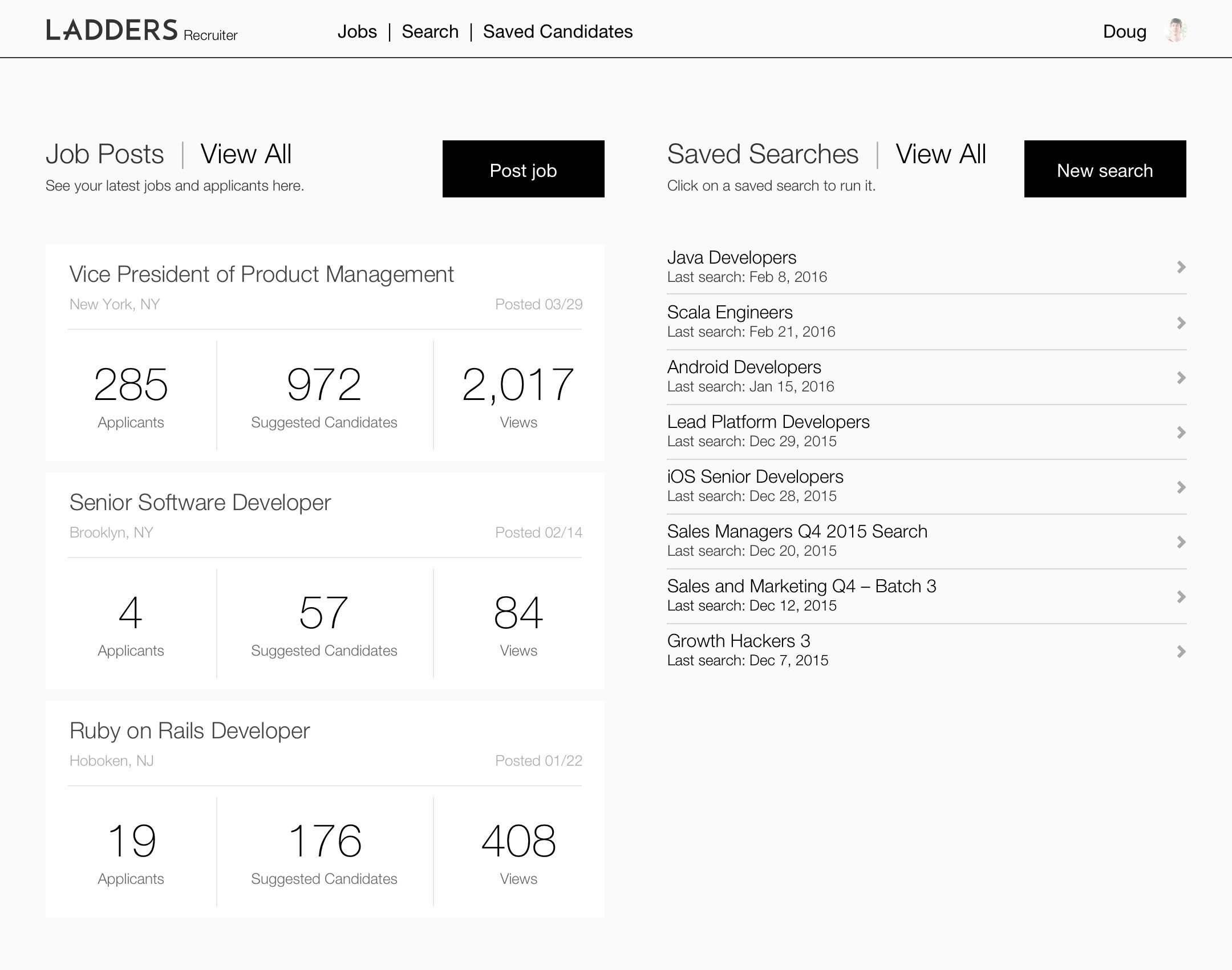
Visual Design
I translated these wireframes into final design mockups. We added some additional information (such as Top Applicants) as needed, after testing out a clickable prototype with recruiters.

Search Results
Our next task was to fix one of the core components of our platform: searching for candidates. Search results were poor and cluttered, and though we had over 8 million candidates in our system, recruiters often found themselves sourcing the same candidates for multiple roles.\u003cbr\u003eI worked in parallel with designers on the candidate team to redesign search results for both sides of the platform. The result on our end was a dramatically simplified display for recruiters, which we started A/B testing extensively.
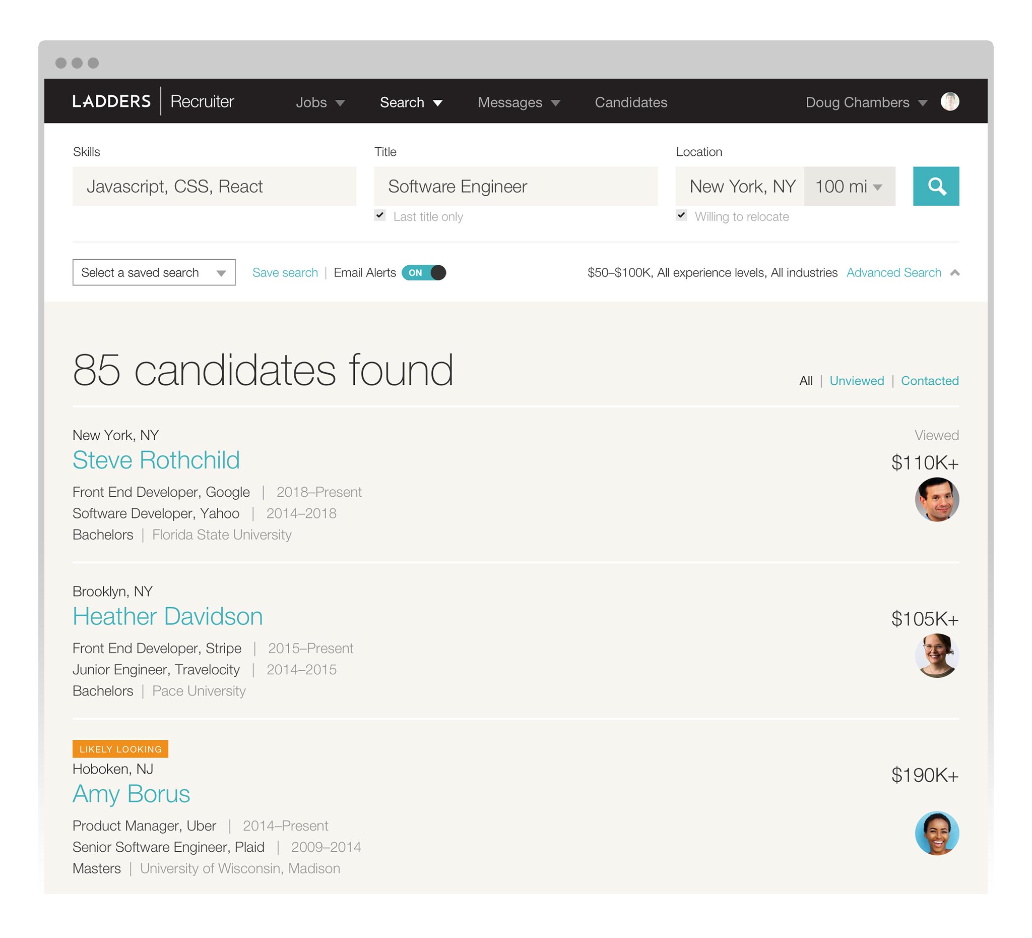
Advanced Search
Working closely with my UX researcher and product manager, we also conducted both moderated and unmoderated user testing. All of these efforts revealed a clear preference for more information—not as much as the original page, but more than what we were currently displaying. We designed a flexible, tabular format with the most relevant information available at–a–glance.

Recruiter Profile
We wanted to start displaying more recruiter information, including a profile picture, to candidates who were searching for jobs. This was part of an effort to differentiate Ladders from the competition—on Ladders you would connect with a human being, not just a faceless job post.
We had data that showed candidates were more likely to interact with recruiters with a profile picture. In order to get more recruiters to upload photos, we needed to overhaul our recruiter profiles so that it was easier to update them. We started by wireframing out the new page structure.
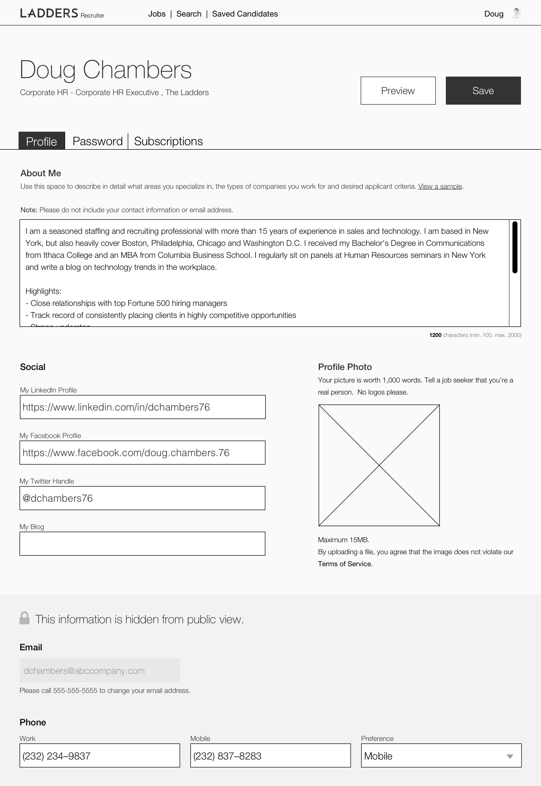
Visual Design
After conducting some limited user testing, we redesigned this page. Recruiter information was reorganized and consolidated into a more user–friendly interface, with formerly disparate functionality brought into the same page for ease of use. We then tested clickable prototypes with recruiters, in order to validate that this accomplished our goal of making profiles easier to update.

Post a Job
Probably the most important task for a recruiter is posting a new job—this is how they make their living. The existing page (pictured here) was functional, but had hidden fields, and didn’t map to a new data structure that our engineering team was building out. We conducted extensive prototyping and A/B testing in order to improve this page for recruiters
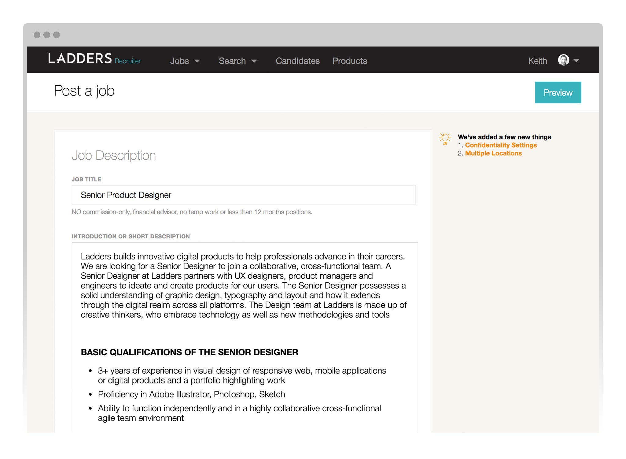
The Redesign
Revamping this page was also key to unlocking the ability to promote jobs, which we planned to be our first paid feature. We designed the page to be responsive, clean, and surfaced all of the options available to a recruiter (no more hard-to-find fields). We introduced the ability to save a draft (a key request from our recruiters). We created more clickable prototypes, conducted moderated testing, and even sat down with recruiters in their office to ensure this new flow would improve their work.

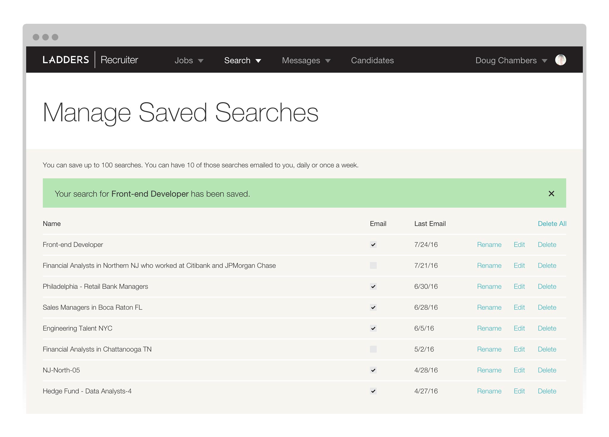
Saved Searches
The ability to save candidate searches existed, but once a recruiter (or more likely, a sourcer) had created one, it was incredibly hard to find. Through wireframing and user testing, we determined the optimal way to surface these lists for recruiters. Revamping this feature unlocked the ability for us to monetize this feature in the future (by setting a max number of saved searches for trials or free accounts).
Promoted Jobs
With our user experience improvements and technical debt taken care of, we turned our attention to our first paid feature. The ability to promote a job was our first strategic foray toward building a fully-functional subscription product. We highlighted the 8x improvement in candidate engagement with a recruiter photo, and A/B tested different workflows extensively to achieve the highest conversion rate.

Manage Jobs
Another key page for recruiters is where all of their job postings live, and we tackled that improvement next. We created a new tabular view for each job, and surfaced all the locations a job might be posted in (a common issue that previously forced recruiters to post the same job multiple times). User testing played a key role in the reworking of this page—we had to account for users with 5 jobs, or 50 jobs.

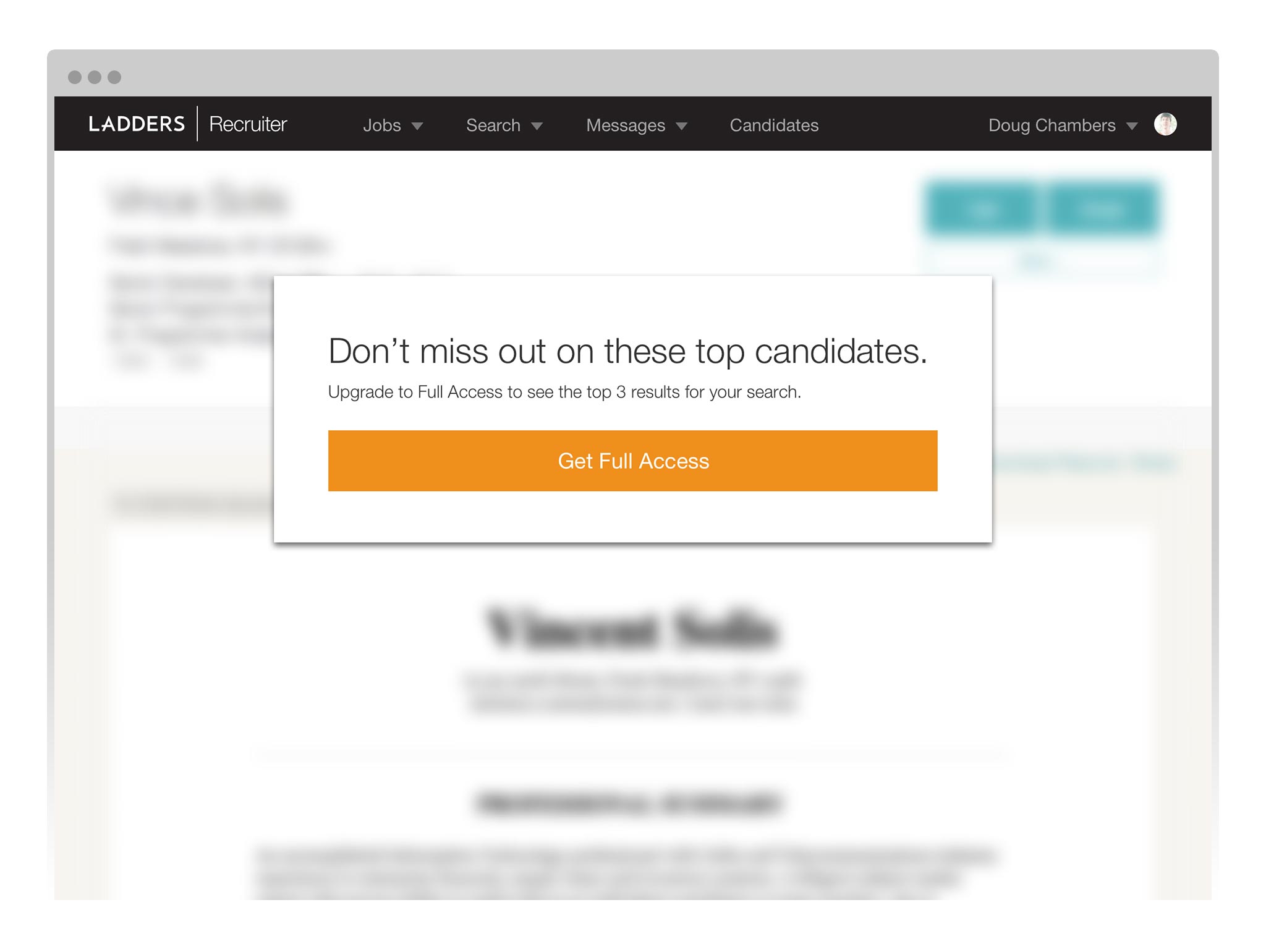
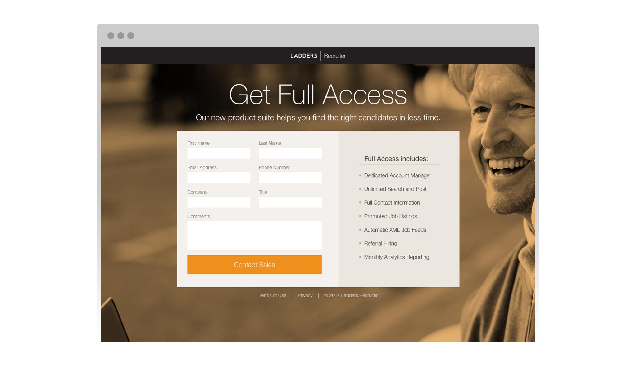
Full Access
Now we were ready to tackle our final objective: the creation of a subscription product. All of our hard work had paid off—we’d rebuilt a solid foundation from a mountain of technical and UX debt. Our team brainstormed many names and decided to call this product Full Access.
Working closely with my UX and product counterparts, we developed a plan to establish limited access to key features, in order to drive recruiters toward purchasing Full Access. We limited search results, experimenting with different ways to do so (one page limit, 3 result limit, 20 result limit per day, etc).
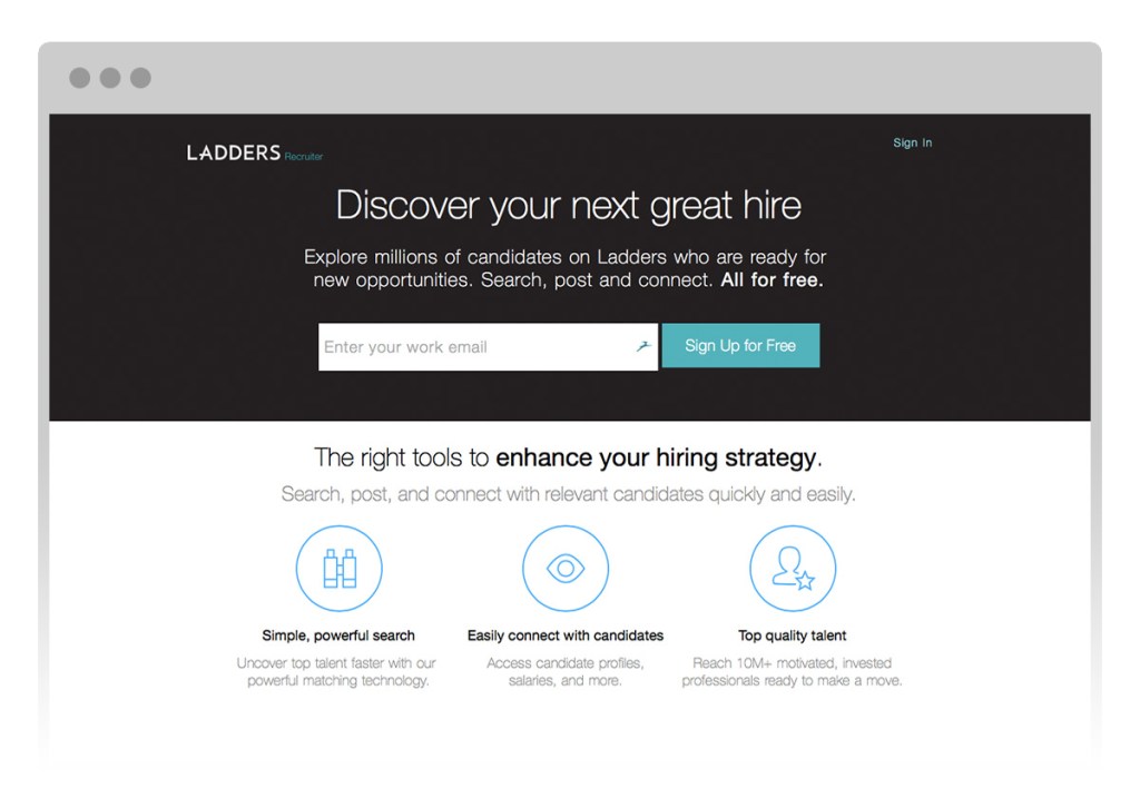
Landing Page
As the results of split tests came in, we iterated and optimized the business model for our product. We paired Full Access with a-la-carte options (for example, the ability to purchase packs of promoted jobs). I created marketing materials, sell sheets, and landing pages for the new product.

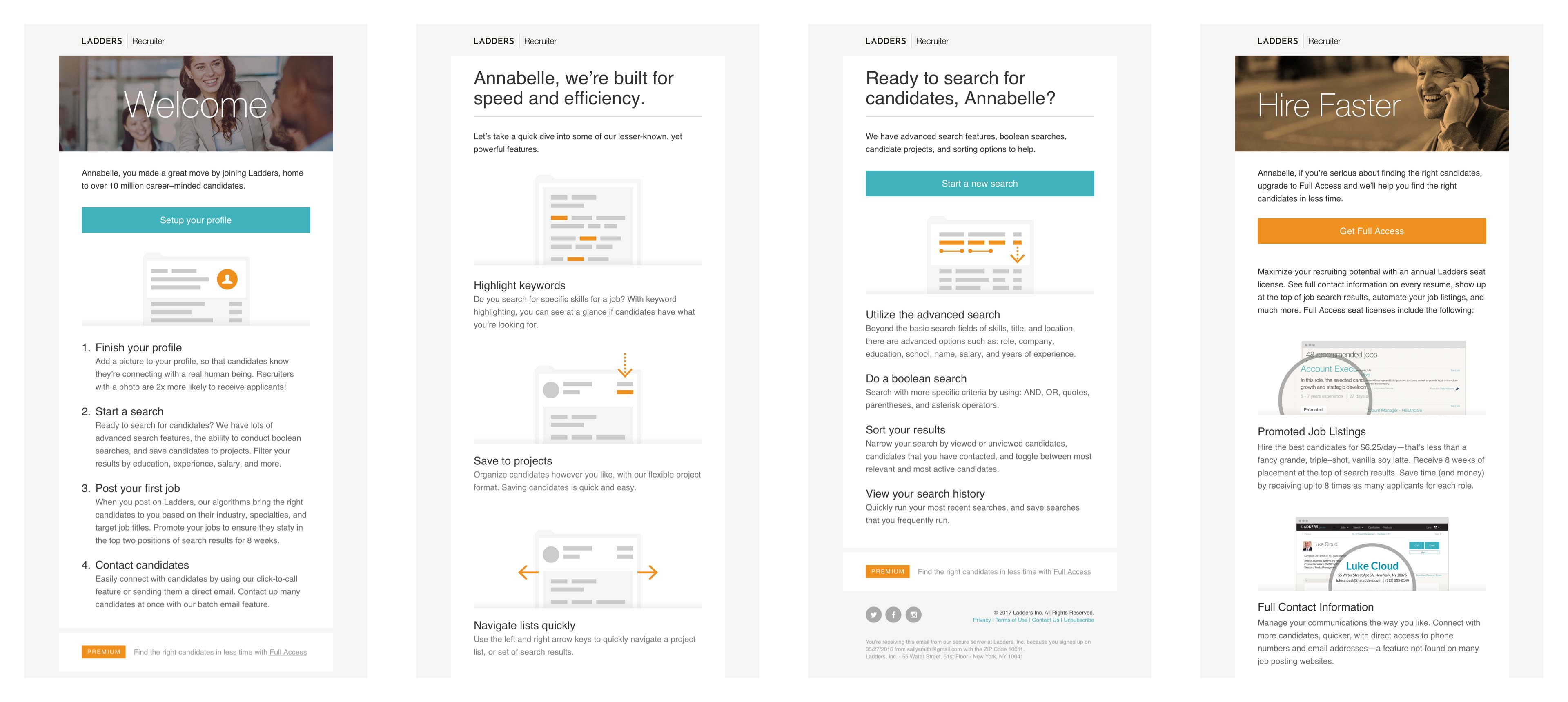
Homepage Illustrations
We created a new homepage for Recruiter, and I built a library of illustrations that highlighted all of our new product’s key features.

Email Campaigns
I led the effort to create a new email drip campaign, designed to onboard users and communicate the value of Full Access. I worked with marketing to spec out each email, and mapped out the logic behind all of the different paths our recruiters might take to upgrade.
Landing Pages
I collaborated with sales directors, marketing staff, and a copywriter to produce landing pages intended to generate qualified leads for the sales team.
The Result
The result was a fully-functional subscription product which generated 22% more profits for Ladders.
